From SMBE 2017 via
benmpeter on Twitter:
Also at SMBE 2017, David Reich is "sad to leave space of f-statistics", presumably because they don't offer enough resolution when analyzing more recent ancient data from such genetically homogeneous regions as Europe. Via
jgschraiber on Twitter.
Update 04/07/2017: A PDF of the Benjamin Peter poster is available at figshare
here (30MB).
See also...
SMBE 2017 abstracts
Matters of geography

21 comments:
Makes sense. If you think about it in terms of ancestral components, basically everyone in Europe is more or less a simple mixture between EEF/WHG and Yamnaya.
EEMS surfaces are pretty cool - I still wonder a little bit about how effectively they aren't a function of sample density though.
Like Korea really only has a Fst of about 0.003 from Central Han, 0.002 from Northern Han and Japanese, or 0.001 from Mongolians. That's pretty fine scale stuff, similar to English at 0.002 from Norwegians, 0.003 from Ukrainians or Spanish.
Similarly, y'know, they don't have a lot of sampling in Iraq and Mesopotamia, so would you get that barrier feature between Iran and the Levant if they did?
Europe is also pretty cosmopolitan in its sampling - many other regions get the HGDP treatment, focusing on isolates...
But generally yes it is recapitulating a lot of features where seas, and mountains and major climatic barriers are forming a real boundary.
path of least resistance
"Oceans such as the Mediterranean"
Full poster is online [30 MB]:
https://figshare.com/articles/poster_as_pdf_pdf/5173447
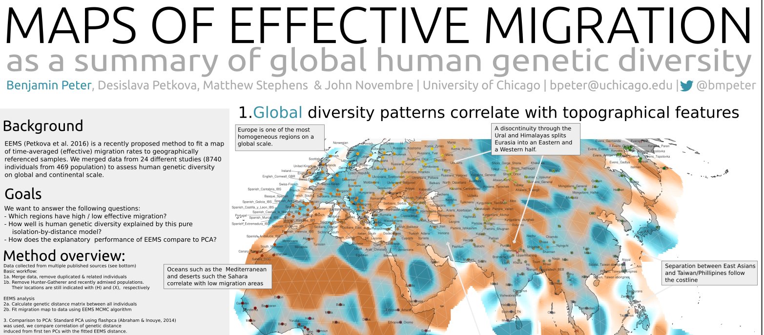
Even though Europe appears homogeneous in the global analysis, EEMS fits a large number of local features.
A region of high gene flow trough Central Asia may reflect frequent gene flow in the past.
In Southern Africa, language group correlates with genetic structure.
Large-scale population movements such as the Bantu expansions result in "corridors" of high migration.
Interestingly global map do not show a Slavic expansion from Ukraine, quite the contrary.
Besides Balkans and Ukraine Slavic populations appear to be as steady, as Baltic ones.
On a local (European) map only strong connection from Poles is to Ukrainians_Lviv which is more than clearly explainable by the recent history.
I also like how this map shows a Balto-Slavic-not-a-cline gradient from Estonia to Czechia.
Germanics on the other hand are in the middle of a Franco-Scandinavian highway.
So after all who migrated on a large scale to Central Europe?
Nice to see the European closeup Arza - Iain Mathieson and John Novembre have run some before with more restricted datasets and got similar patterns, but this probably gives a clearer idea.
The seas are "not barriers, but roads" but only along very specific routes - North Sea, the Northern Mediterranean, the Baltic, North Atlantic between Iceland and Norway.
(Although on the other hand it also shows how the method has limitations for 100% literal real barriers in the case of Europe as well though!
Take the set of French, Northwest Spanish, Southern Spanish, Basque, German, Belgians, and the UK and Netherlands. In their EEMS you get a patterns of high flow from: South Spanish to Northwest Spanish, NW Spanish via Bay of Galicia to French, then French to Swiss French and Swiss German, then from there to Belgians and from there the Netherlands and UK.
But in reality it's not *literally* the case that Normandy was a barrier as in the graph, and of course there was still a fair amount of gene flow across the Pyranees relative to the Bay of Galicia, but the Basques were less likely included for linguistic, etc. reasons and "induce a barrier").
Ukraine on this map is completely unrealistic.
What is south and east was populated just since the end of XVIII century... Maybe authors of this map didn't know about Crimean Chanate:)
@Matt
"it's not *literally* the case that Normandy was a barrier as in the graph"
barriers might not have to be physical imo.
if you look at bioregions e.g.
http://www.ceeweb.org/wp-content/uploads/2011/12/Natura2000EU28Bioregion.png
there may have been invisible barriers where different forms of farming were necessary which acted as a cultural barrier - for example if their land wasn't suitable for wheat then dairy farmers in the Atlantic coast bioregion who married their daughters to wheat farmer's son from the continental bioregion might generate negative selection (and positive selection if it was Atlantic + Atlantic or Continental + Continental) simply through knowledge of how to farm in particular bioregions.
Similarly in Spain with Atlantic vs Mediterranean and Mediterranean vs Continental.
@Me
"barriers might not have to be physical imo."
may be more accurate to say "obviously physical" - i guess climate is physical
spamming but another interesting thing about the bioregions map
http://www.ceeweb.org/wp-content/uploads/2011/12/Natura2000EU28Bioregion.png
is the Black Sea has a different bioregion to the north, south, east and west.
@ Matt
The seas are "not barriers, but roads" but only along very specific routes
Cyprus is probably the best example here.
in reality it's not *literally* the case that Normandy was a barrier as in the graph
But... in the graph there is no barrier in Normandy. Rather there is a barrier between French/Spanish and British data-points. Or even not a barrier, but a gene flow lower than expected for two populations separated by N kilometres, which may be caused by some barrier or may be an effect of e.g. migration.
@ Lukasz M
Ukraine on this map is completely unrealistic.
Simple question: why?
Sure, not a barrier, in Brittany and Normandy, rather a lower migration rate... but I don't think that's likely to be real, if they had samples from Brittany and Normandy in their set. I think it's likely that it "finds" a route the it has found, dependent on the only samples in the set (Belgian, Swiss German) and low gene flow between Northwest France and England is a side effect.
When you look at the Fine Scale Structure analysis of France (https://www.researchgate.net/publication/265299088_Fine-scale_human_genetic_structure_in_Western_France), as a complement to the (I think) POPRES used here, the samples for Normandy and Brittany have a higher Identity-by-State matching with POPRES British samples than they do with POPRES France and higher with POPRES British than with POPRES Belgians.
I mean, I'm pretty sure you wouldn't get the pattern of a (relative) barrier in NW France and a (relative) flow in NE France / Belgium, with more samples; rather you'd get a more homogenous isolation by distance pattern across N France to the UK.
Not that the specific example is that important actually! I think more what I'm saying is that the form of these graph at fine scale is still very sampling point dependent.
On a more positive note though, it will be nice if they can apply this method to measures of long CM IBD segment sharing in future, as that might be a slight improvement in what that they are trying to capture and visualize.
@Arza
Simple question: why?
Simple anwser bas below my comment which you quoted:
"What is south and east was populated just since the end of XVIII century... Maybe authors of this map didn't know about Crimean Chanate:)"
So brown barrier in south and east of Ukraine is created because those regions were populated by incoming middle Russians and north and west Ukrainians. This area is known as "New Russia" till today...
This is brand new population. Unlike Western and partly Central Ukraine.
Or you believe Crimean Khanate is a fraud?:)
http://media1.britannica.com/eb-media/48/3848-004-D31800B9.gif
Thank you! Curious as how my Corded Ware Culture ancient Grandmothers migrated into Germany(from Switzerland, Poland or Czech Republic?) The second map is very helpful.
This article is priceless for Corded Ware Culture research. https://www.academia.edu/5878366/Upending_a_Totality_Re-evaluating_Corded_Ware_Variability_in_Late_Neolithic_Europe._Proceedings_of_the_Prehistoric_Society_FirstView_Article_January_2014_pp_1_-_20._DOI_10.1017_ppr.2013.20_Published_online_28_January_2014
@Azra, in case you're still interested in this, just for a bit more of a comment on how the shape of the migration surface is very sample dependent, see:
http://i.imgur.com/G6Pmc2Q.jpg
This is a comparison series of the EEMS run by Peter on what seems to be a POPRES+Human Origins merge, run by Mathieson in early 2016 on just the Human Origins 2014 and then run by Novembre on just POPRES.
Mathieson runs on a dataset with very rich sampling generally, but no real samples from Germany, Denmark or the Low countries, or Irish samples, and few North Balkans samples. So for one this induces a pretty strong migration corridor between England and Northern France and a North Sea barrier, which also includes Ireland.
Novembre runs on POPRES, a much less dense set, and the opposite inclusion of Danish, German and Low Countries and Irish samples induces a corridor across the North Sea and a barrier / low migration area between England and Northwest France and across the Irish Sea. This model also has a much higher migration rate between France and Spain, without the Basque samples to induce a lower migration region.
The combined model is kind of compromising between the features of both; generally with more bias towards Mathieson's model as the bulk of the dataset is Human Origins, but wtih features of Novembre's where POPRES has more fine scale sampling (NW and Central Europe). It's a good model, but I think the comparison of these runs indicates that you would want ideally a lot more sampling points across the European plain from Northwest Ukraine to Northwest France, to really get anything as solid as in the densely sampled south.
Hm. To me it looks like its only using the datapoints. The Krim does not have any Datapoint. The brown in it represents the relationship between Ukraine and Turkey.
Pretty hard to read that map.
What exactly does it say about Germany?
Blue to Austria = Genetic relationship closer than geographic distance.
Grey(?) to Switzerland? = Genetic relationship equals geographic distance?
Light brown to France, Belgium and Britain? = Genetic relationship slightly smaller than geographic distance?
Then grey again to Netherland and Denmark = relation equal to distance.
Light brown to Sweden. = less related than distance suggests
Medium brown to Poland and Czechia = far less related than distance suggests
Or am I missinterpreting this?
But if its like this, then France is far less related to Britain than geographic distance suggests. (But there is only a single datapoint for all French!)
Couple things to bear in mind with this may be:
a) Where there isn't specific designation like Kent, Lviv, etc. some of these samples from across the nation may have been placed centrally for the sake of convenience. If you get, like a set of samples with a very slight bias to Southern France>Northern France, and the dot is placed in Central France, than that would affect EEMS.
b) The model may be compromising the distances between local pairs to fit all pairs.
So if you have French actually quite related to English, and English quite related to Scotland, but Scotland less related to French, then a barrier between England+France may end up being a more optimal fit to distance than a barrier between England+Scotland.
Also true for longer range comparisons, as IRC all the samples in the set inform the position low vs high migration rates, so a barrier between England+France may be partially influenced by the distance between England and Italy / Spain, rather than England and France alone, and so on.
Section 4 of the poster is pretty interesting in showing that the "EEMS distance" pretty much captures the between population genetic distances (correlation 0.95) while the first ten PCs are much less efficient at capturing the distances between (correlation 0.67). The first ten PCs may capture more of between individual differences though.
https://i.imgur.com/9bltk9U.png
This is actually not the case in the global view, where the EEMS captures fewer population differences than first ten PCs; I guess as structure less geographical in the global context.
Post a Comment